This is a post which explains screens and functions of my site Dozilla.io.
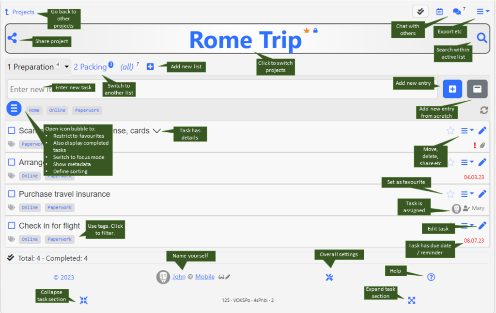
Once you drilled into a project (or a project was shared to you), you see the main screen with the tasks (list entries). It consists of the following areas:

- The top section where you switch between task, calendar and chat view and have a menu icon for some project-wide functions (e.g. export) – at the top right.
- The main project title with share and search options.
- The row of lists within this project – by default there is one list called “To do”, which can be renamed of course.
- The section to add a new task. Shortcuts are possible (see keyboard shortcuts on a desktop). If you previously used tags, these will be listed – click a tag to add it to a new task.
- The icon ” bubble”, which expands to show several icons when clicked: Here you can set the following (always valid for the current session):
- Show only favourites
- Switch between “Show only open tasks” or “Show also completed tasks”
- Switch to “focus” mode, meaning that distracting screen elements will be displayed less prominently.
- Extend all tasks to show details and metadata
- Define sorting parameters and direction
- On the right there is an icon to refresh the screen – This icon is normally not active and can be clicked only when someone else changed something meanwhile in this list (then it will rotate)
- The actual list of tasks (entries). Details of a task are expanded if you added or updated that task just before; or click on the arrow-down icon to expand a task’s details. The edit icon is always visible on desktops; on mobile only for the last added or updated task. Use the task menu to edit it.
In the bottom row of a task you will see a series of icons, depending on the additional attributes which were set when editing a task.
At the very bottom you see a summary section with some statistics. Below it, you can (and should) change your name if needed. The little wrench icon opens a settings dialog.
I suggest that you open this screen on a laptop/desktop at least once and hover over the individual items/buttons/elements with your mouse. There are a lot of explanation texts being displayed on mouse-over which you won’t see on a mobile phone or a tablet.
Click here to see all articles about Dozilla.io.
Leave a Reply